
Is the gate open, and for how long?
I live next to a level crossing and I was tired of guessing. What I really wanted was for Google Maps to know about it. This is the app I built on the way there, and how its main screen took four versions to say what I needed.
- What it is
- Level crossing status for drivers in Great Britain
- Where
- Web, iOS and Android, plus an iOS widget
- My role
- Solo. Product and UI design
- This write-up
- The interface only, not the prediction work behind it
A closed gate tells you nothing
If you live near a crossing you know the routine. Google Maps sends you straight at it. The barriers come down. You sit there with no idea whether it's one train or four. After a few minutes you give up and start turning round, and that is exactly when the barriers lift.
I wanted something I could glance at before leaving the house, or while stopped in the queue, that would tell me roughly what was going on.
There's one catch that shaped everything. The app can't see the barriers. It works out what they're probably doing from where the trains are. So whatever I put on screen had to be quick to read and also had to be honest that it's a guess. I didn't want anyone trusting my app over the red lights in front of them.
What I kept coming back to
- The screen has two questions to answer: open or closed, and for how long. Anything else has to justify being there.
- Say "likely". Never show an old answer as if it were current.
- Red means the gate is closed. It doesn't get used for anything else.
- Don't rely on colour. The words and the mascot should say the same thing.
- No onboarding. Show something useful first and ask for permissions only when someone taps the thing that needs them.
I didn't set out to build an app
The thing that's missing isn't another icon on my phone. It's that the navigation app I already use treats a level crossing like any other stretch of road. So my first idea was a plugin: something that sits inside Google Maps or Waze, knows when the barriers will be down, and works that into the journey time.
That door is shut. Neither app lets an outsider add anything to the route you're looking at. The most you can do is go the other way round: work out a route in your own app and hand it over with a link.
So the second idea was a companion. You'd tell it where you were going. It would split the drive at the crossing, add the wait, and say "leave by ten past to get through before the train". One tap would open Google Maps with the route loaded, and if you got caught at the gate anyway, a departure board would come up on CarPlay. I wrote that version up in a lot of detail, screens and all. Then I dropped it.
- It cost money on every use. Each journey check meant paying Google for routing. For a free tool aimed at my neighbours, that was the biggest bill by far.
- It needed to follow you around. Background location is hard to get permission for, and people are right to be wary of it.
- Advice is a much bigger promise than information. If I tell you to take the detour and the gate opens thirty seconds later, I've made your day worse. I hadn't earned that kind of trust in my predictions.
- Nobody thinks about a crossing until they're stuck at one. A tool that quietly watches in the background is fighting how people behave.
Take all of that away and one thing is left underneath: knowing what the gate is doing. If that part is wrong, nothing built on top of it matters. If it's right, it's useful to more than just me. So the app is the smallest thing I could make that puts that one answer in front of real drivers and lets me check it against real gates.
Friendly, and answering the wrong question
The first version was called Cross Badger. I still like a lot of it: the red badger, the warm paper background, the soft rounded type. It felt like a neighbour and not like a rail industry tool.
The trouble showed up as soon as I used it at the actual crossing. The biggest thing on the page was when the next train was due. That's what the data gave me, so that's what I showed. But I don't care about the train. I care about the gate, and I was doing the conversion in my head every time.
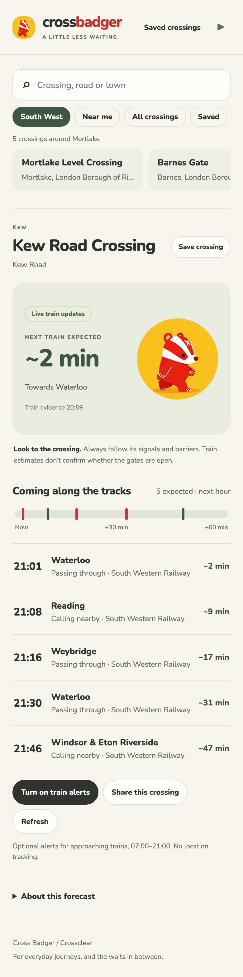
- The headline is a train time. You have to work out the gate yourself.
- Too much going on in the main card. A pill, a small caps label, a caption under the badger and a timestamp, all fighting the one number that matters.
- Red is the brand colour. The logo is red, the selected crossing is red, the train markers are red. So red can't mean "closed".
- "~2 min". I liked how compact the tilde was. It's still a symbol doing a word's job.
- It assumes you're me. My own area is preselected and my own crossing loads by default.
- The badger is stuck on a yellow circle, and the button to pause it is up in the header, nowhere near it.
- The timeline shows trains as little ticks. Same problem as the headline. It's the raw data, not the answer.
Gate first
For the second version I didn't touch the data at all. I rebuilt the page in a separate copy so I could compare the two side by side, and changed only the layout, the hierarchy, the colours and the words.
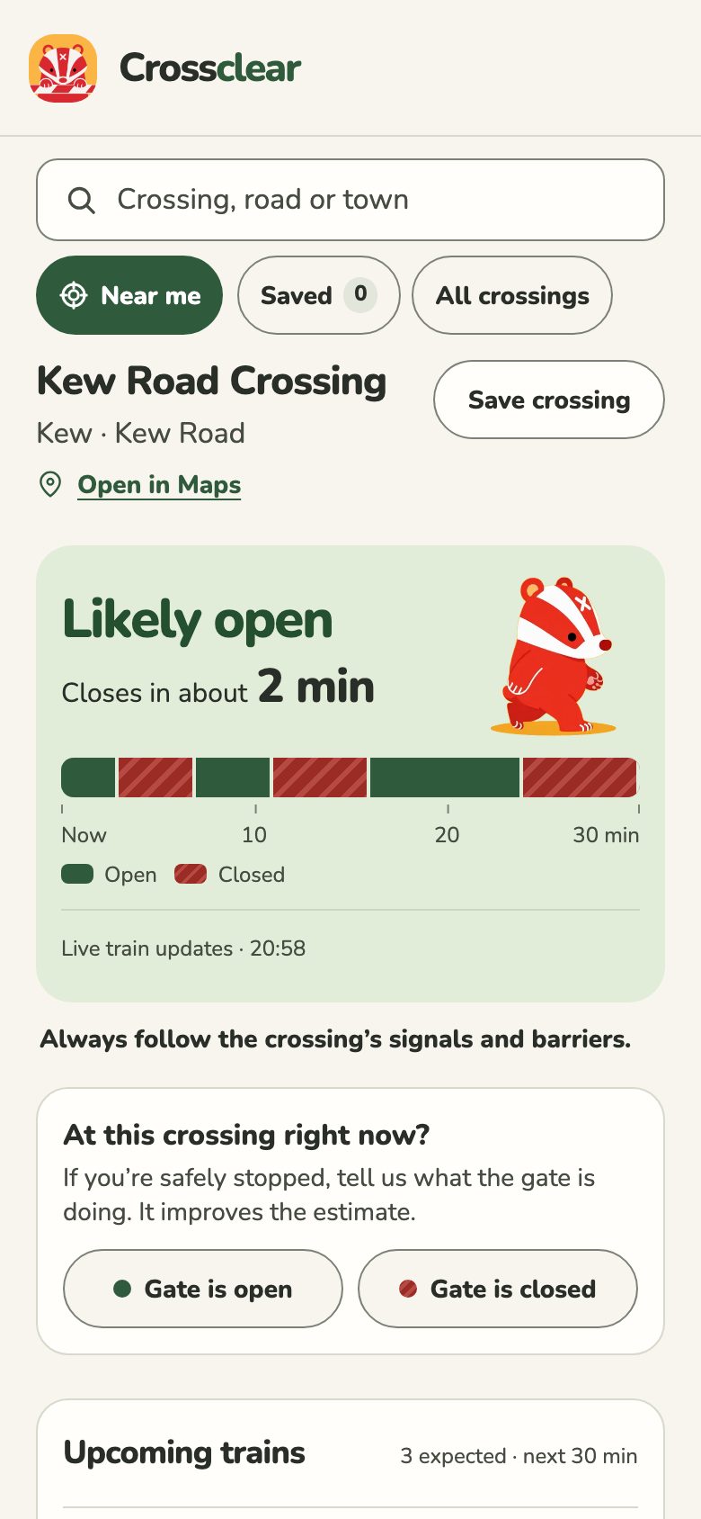
The headline became "Likely closed" or "Likely open", with a countdown directly underneath. That one word, "likely", let me delete a whole paragraph of disclaimer. The logo and every selected state went green, which freed red up to mean one thing. The tilde became "about". The clutter inside the card went, and where the estimate came from shrank to one quiet line at the bottom.
Version 1
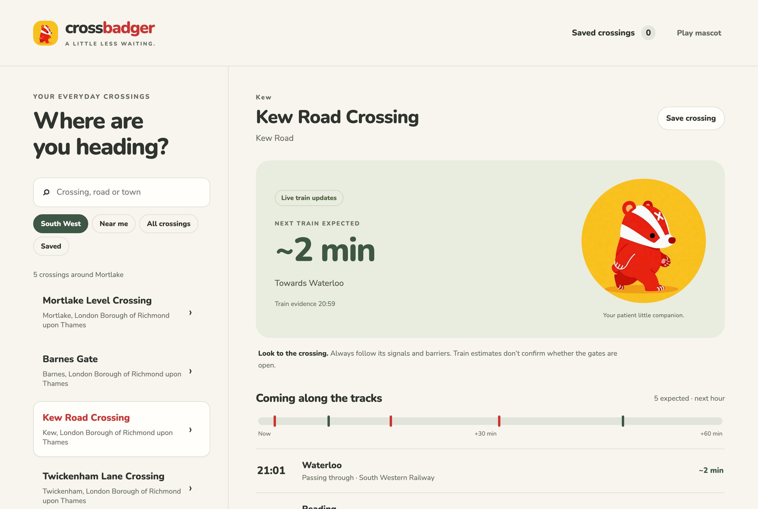
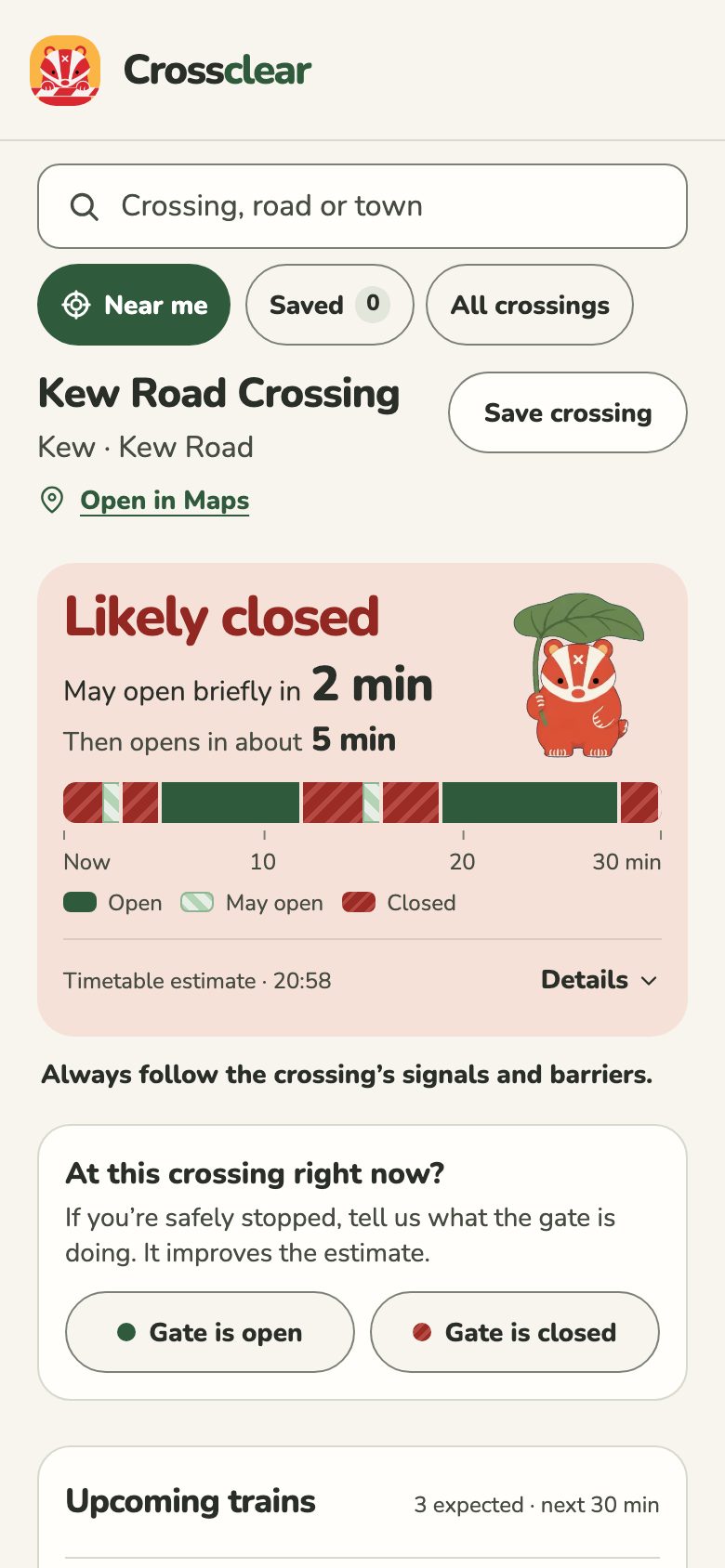
Where it ended up
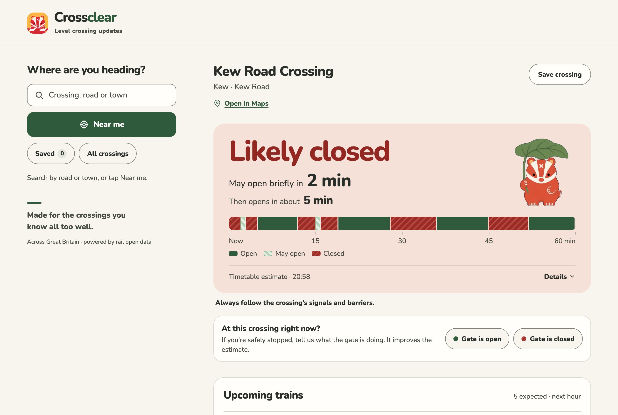
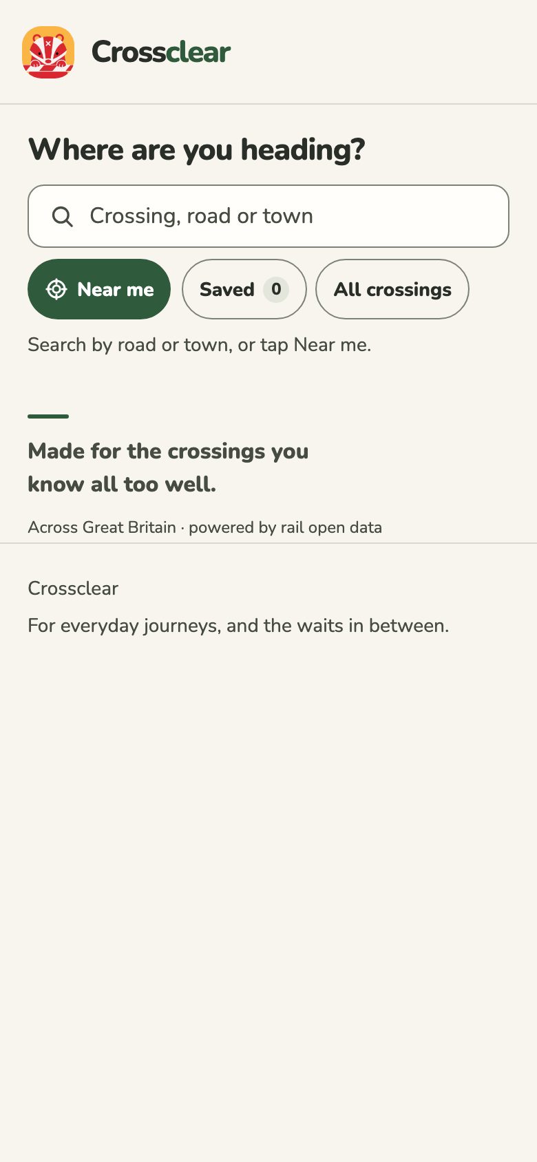
I also took myself out of it. There's no default crossing any more. The first time you open it you get a search box and a big Near me button, and it only asks for your location when you tap that. Come back later and it opens on the crossing you looked at last.
First visit
Coming back
Other people started using it
Version 2 worked for me. Then I gave it to other people and found three things I couldn't have spotted on my own.
Gates sometimes open for a moment
Between two trains the barriers can lift for a minute and drop again. Version 2 just said "closed" through the whole thing. So I added a note to the card: "May open briefly between trains."
Nobody understood my report buttons
I'd added two buttons so people stopped at a crossing could tell me what the gate was really doing, which helps me check the estimates. They said OPEN and CLOSED. People had no idea what they were for.
What I wrote first
At the crossing?
Only report what you can see, while safely stopped.
I can see: OPEN / CLOSED
Help us improve estimates…
What it says now
At this crossing right now?
If you're safely stopped, tell us what the gate is doing. It improves the estimate.
The fix was mostly writing. The buttons became whole sentences. I also made them plain outlines with a small dot, never filled red or green, because a big red button that says "closed" looks like the app telling you the gate is closed. There are no streaks or leaderboards for reporting. I don't want to give anyone a reason to pick up their phone while the car is moving.
The card had filled up again
This one stung a bit. By now the card also said how long the gate would stay open afterwards, how many trains were in this closure, when the next one was due and where it was heading. Every line was true and I'd added each one for a reason. The feedback was that it was wordy and slow to read. I'd spent version 2 clearing the card out and then quietly refilled it.
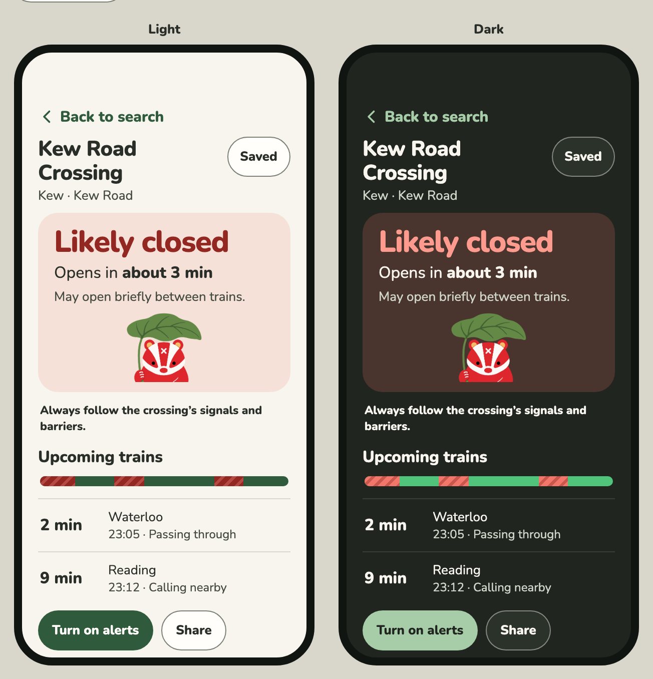
Two answers and nothing else
So I gave the card a rule. It can hold a headline, one or two lines about time, a bar, and a line saying where the estimate came from. That's all.
Likely closed
May open briefly in2 min
Then opens in about5 min

- Headline
- Open or closed, in the state's colour. The biggest thing on the screen.
- First line
- Whatever changes soonest, with one big number.
- Second line
- Smaller. Only there when a brief opening might come first.
- Bar
- The next half hour on a phone, the next hour on a wide screen.
- Footer
- Where the estimate came from. Everything I cut lives behind Details.
Whatever happens soonest goes first
The brief opening was the part I'd got most wrong. I had it as a footnote. But think about who's reading: someone in a queue deciding whether to turn round. For them, "might open in 2 minutes" matters more than "will open in 5". So now the possible opening leads and the certain one follows.
The bar shows gates, not trains
I was attached to showing trains on the timeline. First as ticks, then as dark markers sitting on top of coloured blocks. People read the markers as dividers. Once I took the trains off completely, the bar finally made sense to people without me explaining it.
Version 1
Each tick is a train. You work out the rest.
Current
Green is open, red stripes are closed, pale hatching is "might open".
The stripes are borrowed from a real barrier arm, and they mean the bar still reads if you can't tell red from green. I moved the bar up into the card because it's about the gate, and it had been sitting under the list of trains. On a phone it only covers half an hour, because a two-minute closure squeezed into an hour was a sliver you couldn't see. And if the app has no estimate, the bar isn't drawn at all. An empty bar under "No estimate" looked like it was saying the gate was open.
The states where it doesn't know
An estimate is only good for about a minute. The worst thing this app could do is leave "Likely open" on screen after the data behind it has gone stale. So I spent as much time on the unsure states as on the confident ones. Red and green only appear when the app is willing to stand behind an answer. Everything else is grey, with a badger scratching its head.
Likely closed
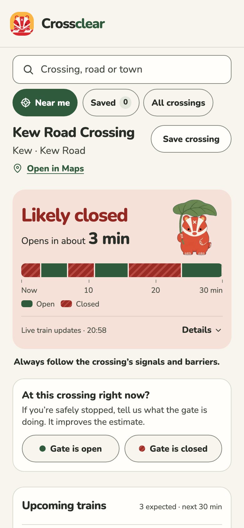
Likely open
Likely open, nothing due
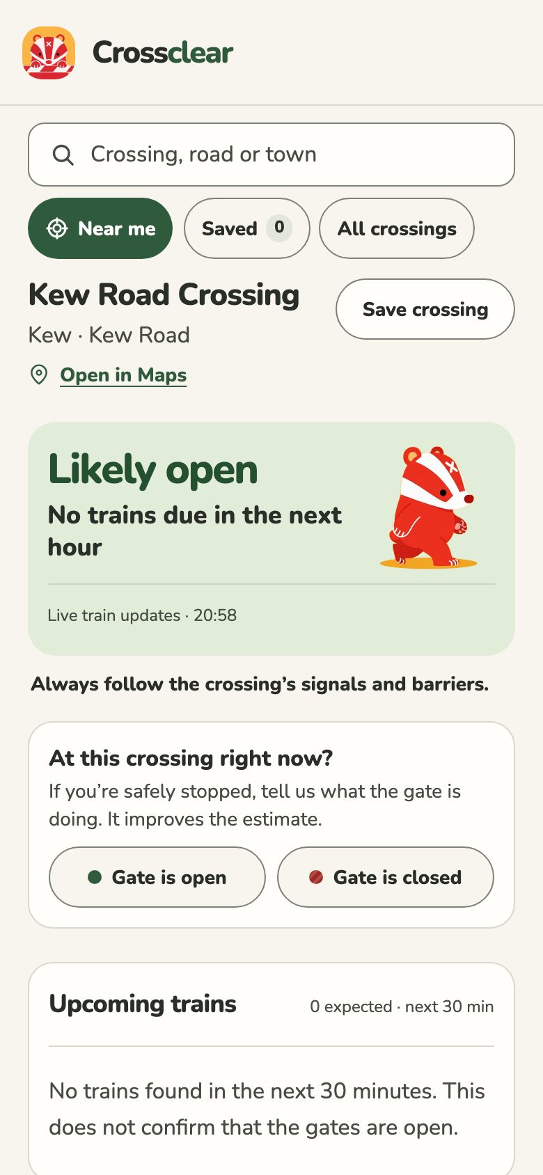
No estimate
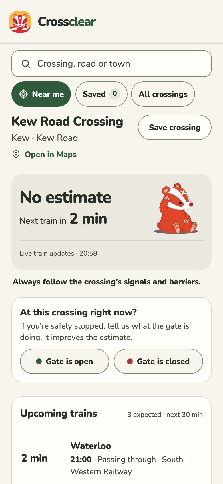
Out of date
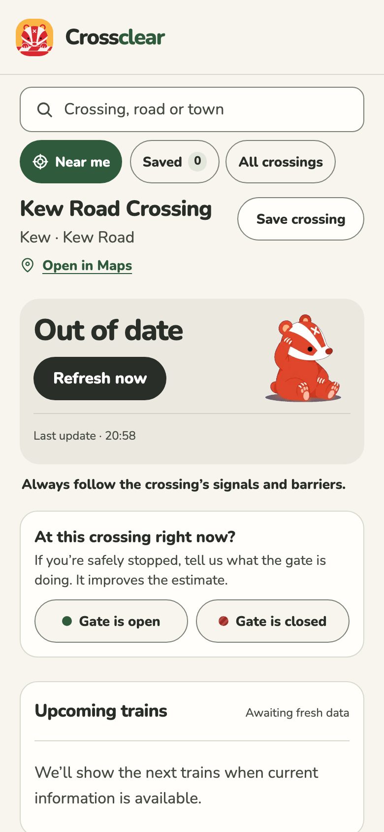
Unavailable
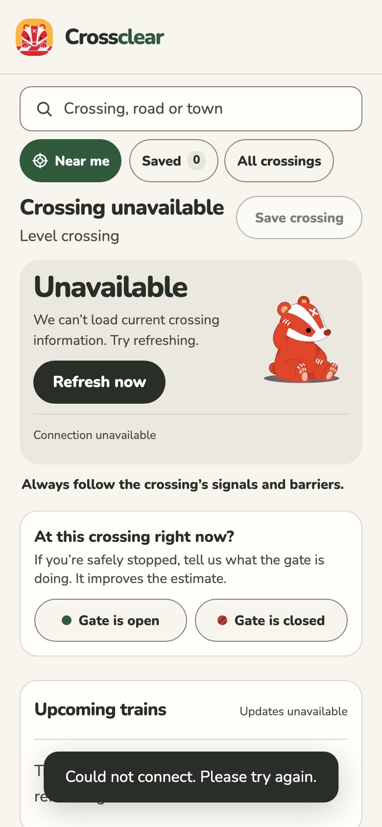
Few colours, each with one job
I never added a colour after version 1. What changed was what each one is allowed to do.
PaperThe background. At night it turns a warm dark green, not black.
GreenThe brand, buttons, anything selected or saved.
ClosedRed, and only for a closed gate.
OpenA softer green tint behind the headline.
Don't knowGrey for every state without an answer.
FocusBlue, so a keyboard outline never looks like a gate state.
The type is Nunito throughout. Its rounded ends match the badger, and they stop a big red "Likely closed" from feeling like an alarm going off.
Dark mode came late and taught me not to trust my eyes. My first pass looked fine on my screen. When I actually measured the contrast, the red headline on its tinted card and the outlines on buttons both failed. I ended up giving the dark cards solid colours so the text doesn't depend on whatever happens to be behind it.
The badger
The badger is the personality, and it's also a third way of reading the state after the words and the colour. It waits under a leaf when the gate's closed, walks when it's open, and scratches its head when the app doesn't know.
WaitingLikely closed WalkingLikely open
 Head-scratchAnything it isn't sure about
I set myself one rule for it: the badger never tells you it's safe to cross. A happy walking badger is as far as it goes.
Two smaller fixes. The animation used to have that yellow circle baked into the video, so I had it redone with a transparent background and now it sits straight on the card. And I'd put a pause button on the badger itself, until someone reviewing it pointed out that Duolingo keeps that kind of thing in settings. They were right. It's a switch in settings now, and if your phone is set to reduce motion the badger just stands still.
The same rules everywhere else
Loading
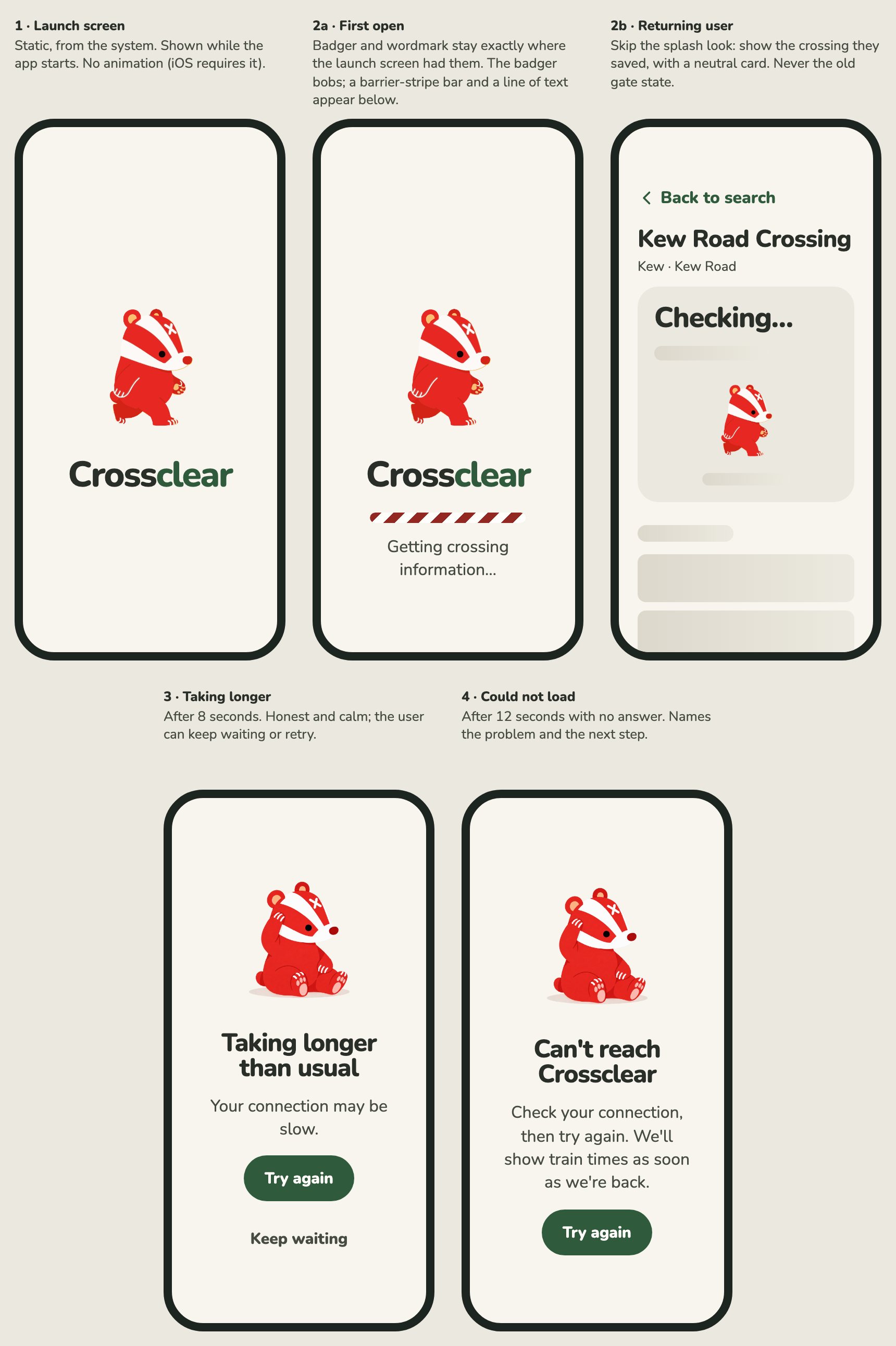
The app used to open on a white screen and a spinner. Now the badger and the name stay in the same place from launch into loading, so nothing jumps, and the progress bar is a moving barrier stripe. If you've used the app before, you skip all that and see your crossing's name straight away with a grey "Checking…" card. What you never see is the answer from last time. If it's slow, the app says so and lets you choose between retrying and waiting.
The widget
The widget is the bit I wanted most for myself: a glance at the home screen before picking up the car keys. My first design for it was dark and built around a countdown. I threw that out for a big badger and three lines of text.
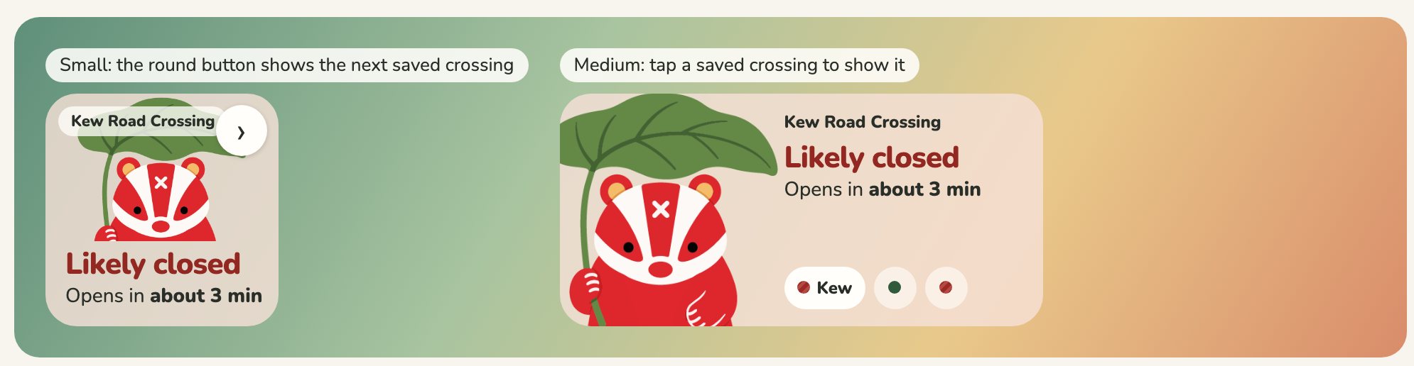
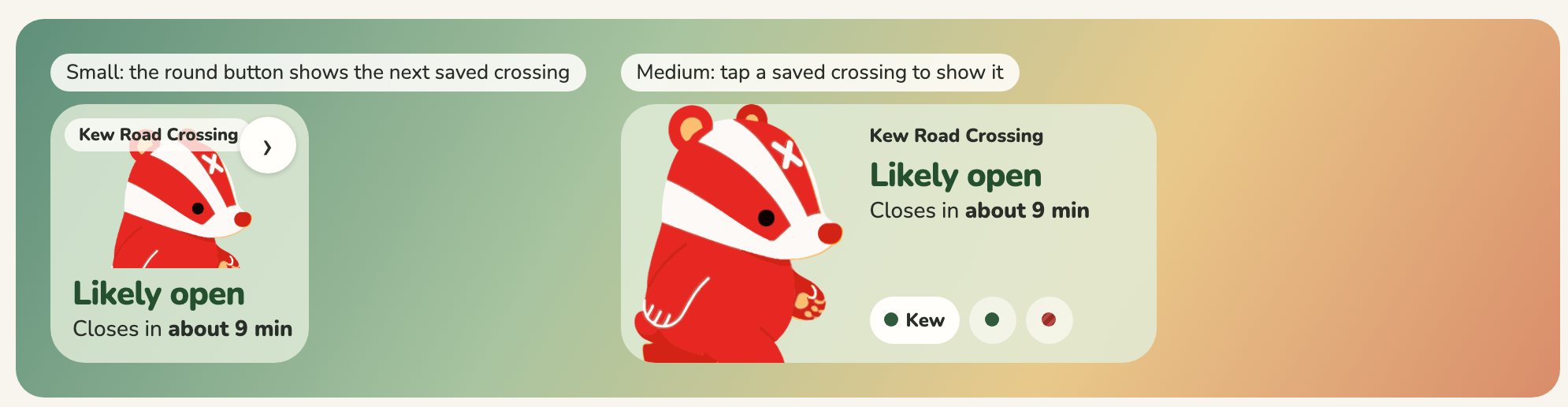
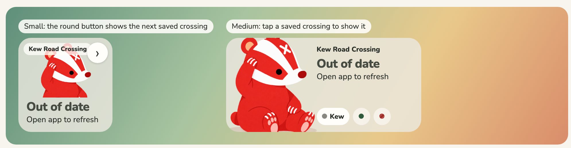
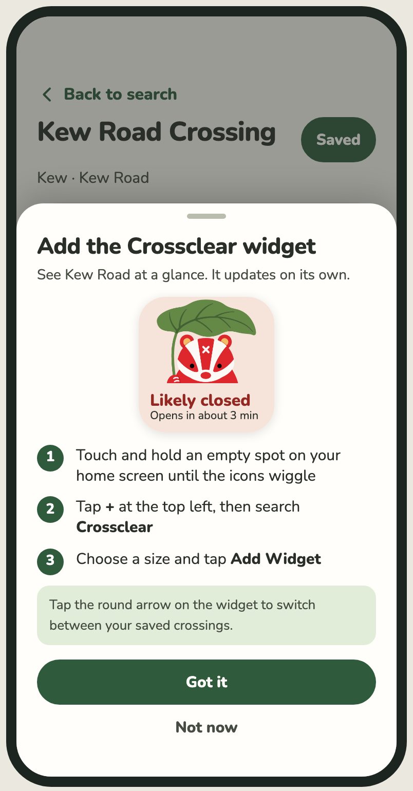
The awkward part is that iOS only lets a widget refresh every so often, so it can't really be live. I didn't want to hide that. If the widget hasn't had fresh data for a while it flips itself to "Out of date" instead of carrying on showing an old answer. On the lock screen there's no colour to work with, so closed gets a dashed ring and open gets a solid one.
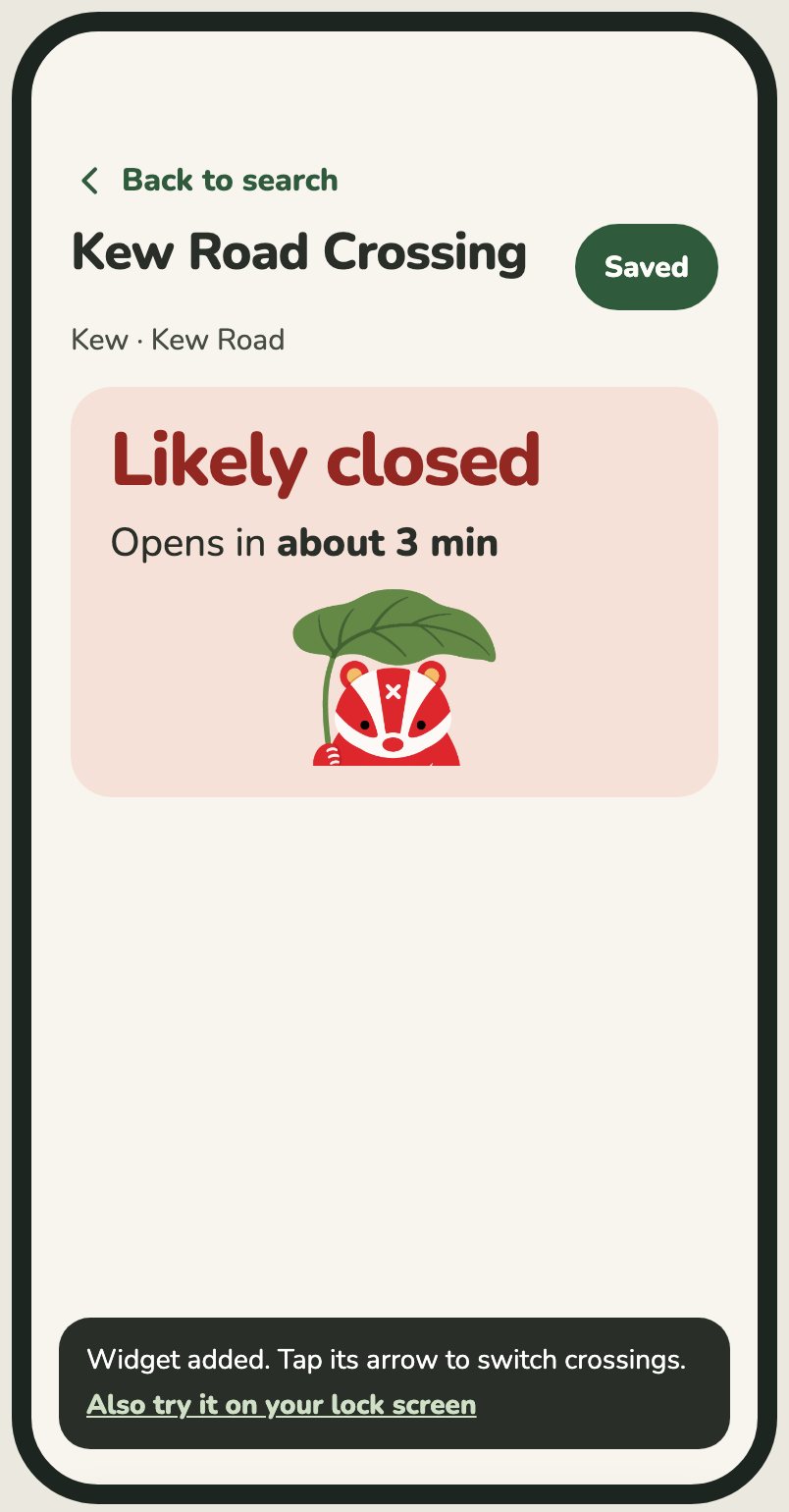
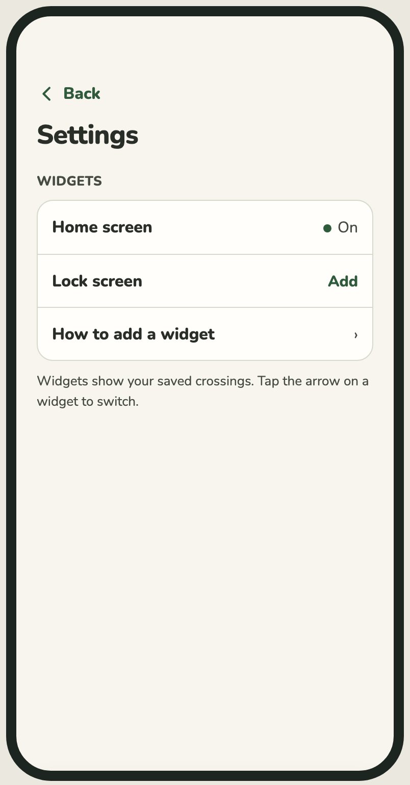
Getting people to add it was its own small problem, because an app can't put a widget on your home screen for you. Before, there was a button buried at the bottom of the page that ended in a pop-up. Now a card appears the first time you save a crossing, which is the moment you've shown you care about one. It walks you through adding the widget and then leaves you alone. It never shows up on first launch and never blocks the screen.
After saving
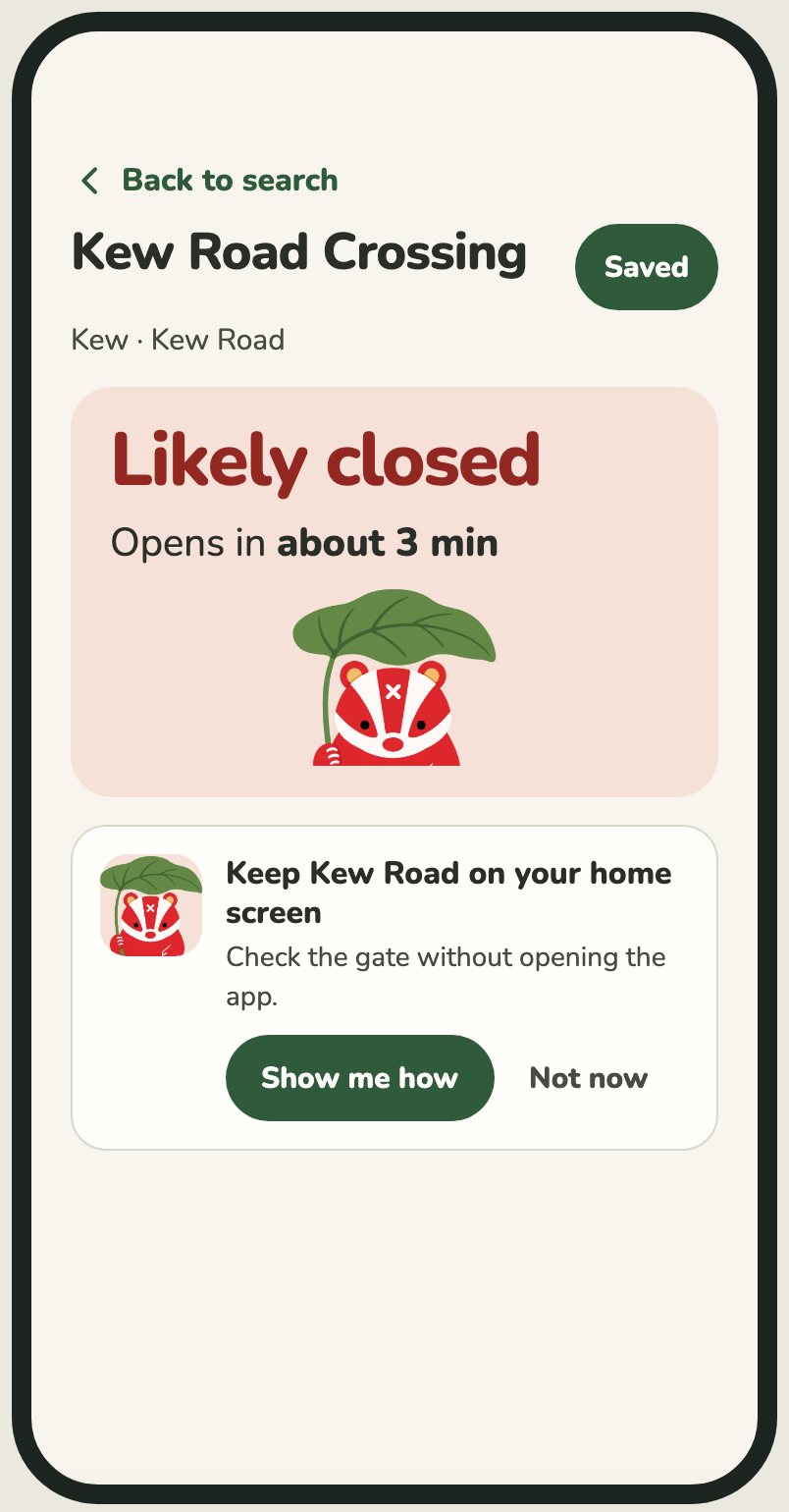
How to add it
Done
Always in settings
Search
Someone testing it, who also lives beside a crossing, typed in the name of their town and didn't find their own crossing. That was a bad moment. It turned out lots of crossings are filed under the nearest hamlet, or have no real name at all, and a surprising number are just called "Station Road".
Most of the fix is in the data. The part that's design is that every result needs a name a person would recognise and a second line that tells it apart from the one below.
Before
1 result
The design I'm building next
4 crossings near Egham
What I'd tell myself at version 1
Most of this project was taking things away. Every time the main card got better, it was because I'd removed something that was accurate and that I'd been pleased with when I added it. The train ticks, the tilde, the extra facts about the closure. I find that hard, and I expect I'll have to do it again.
The other thing is how much of it came down to wording. "CLOSED" on a button confused people and "Gate is closed" didn't. "Likely" did more for honesty than any disclaimer. I went in thinking of this as a visual design job and a lot of it was writing.
It isn't finished. The web version is the furthest along. The app is catching up to it, and the widget, the new loading screens and the search results are designed but not all built yet. I also haven't properly tested it with a screen reader or on enough real phones, and I don't have usage numbers to show. What I do have is a screen I can read at a glance from the driver's seat, which is the thing I wanted when I started.
Where this is meant to go
The app was never the end goal, and I nearly lost sight of that while polishing it. Waze and Google Maps both already warn you that a crossing is coming up. Neither knows whether it's shut right now, or whether it will be when you get there. That gap is the thing I've been building.
The way in isn't a plugin. Both take data from outside through partner programmes, but those are set up for councils and highway authorities reporting roads that are closed for hours. A gate that drops for three minutes doesn't fit, and neither does one person with a badger. What I'd actually be offering is a forecast: at this crossing, expect it shut between these minutes. A route planner could treat that as extra journey time, the way it already treats traffic.
To have that conversation I need proof that the forecast is right, across enough crossings to matter, and probably a partner with more standing than me. The app is how I get the first two. Every "Gate is closed" tap from someone sitting in the queue is a small piece of evidence. That's what the interface in this case study is really for.